
Every monday morning:
someone opens the latest KPI dashboard
Revenue is up.
On-time delivery is down.
Inventory increased.
Customer satisfaction slipped a little.Everyone nods.
A few questions are asked.
“Are we sure this data is correct, my report says something else”
Then the meeting moves on.
If this sounds familiar, your dashboard may be measuring performance without actually improving it. Just measuring.
Dashboards are designed to answer one question
In recent years, many people have found a job in ‘data’ and ‘data visualisation’. We have some great tools at our disposal like PowerBI, DOMO, Tableau etcetera. However I have found that nicer the dashboard looks, the lesser it’s actual use for the business.
Nice dashboard answer a simple question: “what happened”. Did revenue go up or down? Where did we land on complaints? How many customers are behind in payment? What is the Defect PPM for our production line x?
And typically it stops there.
- It doesn’t facilitate the next set of questions:
- Do we understand what happened?
- Do we know why this happened?
- What should we do about it?
Five reasons dashboards rarely change behaviour
1. The dashboard shows measurements, not KPI’s
A measurement is a data point. A dashboard is a set of measurements. A measurement is like saying it’s 34℃ out there today. But what does that tell you? What is normal, what were we expecting? What was it last year the same day? A measurement needs a lot of context for it to make sense. Most importantly it doesn’t communicate whether it’s good or bad. 34℃ on a summer day in Barcelona makes sense, for an April Saturday in Edinburgh it’s very specials. One is around the expectation, the other is a heat wave that should trigger a warning.
A KPI’s is a measurement, but with fixed context. A KPI has a target, an actual, a GAP and ideally some historical reference. So 100k in revenue might be good, but if the target was 150k and we did 130k last year same period, we have an issue to look into. It’s actually a miss. Three misses in a row could/should trigger the team to think about writing an A3 Problem Solving Report.
2. Too much data, too many measurements
Many dashboards, certainly when made on request of senior leaders with new questions every week, tend to show a lot of data points. Every week a new datapoint gets added which makes sense at that moment, but people forget the relevance six months later.
The more data and metrics you have, the harder it is to see how the business is really doing. Which is the most important? How do we know in 5 seconds if we’re winning or if we’re losing?
3. No ownership
A KPI, every KPI, needs to have an owner. And that owner needs to be as ‘low’ in the organization as possible. It needs to be someone that actually 1) knows what’s going on and 2) can actually drive impact. Ideally every KPI shows a name, not a department
It’s important to understand here that the name is required not for blaming, but for accountability. This person will make sure we drive to real understanding, is able to talk to the reality at gemba and can own the countermeasures needed to bring the KPI back on track.
4. Only looking back, not looking forward
Many dashboards and many reviews look backward. The look at what has happened. After the fact. And a conclusion could be ‘yes we had a bad month’. But when the month is gone, there’s nothing you can anymore. That’s why it’s important to have a balanced view of leading and lagging KPI’s in your KPI dashboard. Leading KPI’s have metrics higher up the process that have a predictive value to your ultimate KPI. If revenue is a lagging KPI, opportunity generation is leading KPI. If customer satisfaction is an important lagging KPI, on-time delivery (OTD) could be a great leading KPI.
5. It doesn’t drive action
The most important thing, the difference between good and great companies is that they don’t do weather reporting. A KPI (whether is green or red) should drive action. It tells you where you’re winning and where not, it shows the name of who is accountable and the format of your dashboard should allow for discussion and action. The number are meaningless if there’s no action tied to it.
Dashboards don’t improve your business, people do
KPI’s are meant to drive action. A great team will have a small set of KPI’s to visibly show if you’re winning or if you’re losing. The KPI dashboard will show the current state and incite a discussion in the team to lead to actions. Accountability will then ensure the actions are executed and reported back to team.
It’s not about a dashboard, it’s about the team. And the team needs a simple but powerful tool to have the discussion, to drive improvement and to ensure accountability.
A simple KPI bowler works like magic
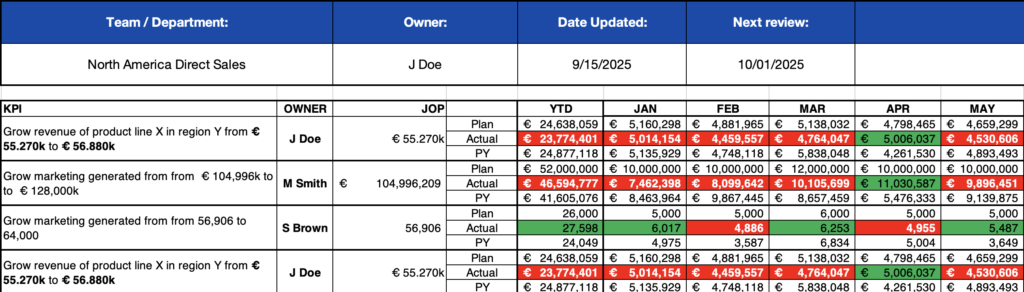
A KPI Bowler, named after the resemblance to a bowling chart is simple. There’s a KPI that is always phrased ‘grow x from a to b”, it has an owner, a jump-off point (JOP) and a monthly target and actual. A YTD-view helps to keep an eye on the trend.
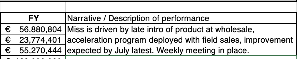
Before this KPI Bowler is reviewed with the team, the owner fills out the last column. This describes what’s going on, why and what we will do about it. It’s like on the fly problem solving.
You should try it now.
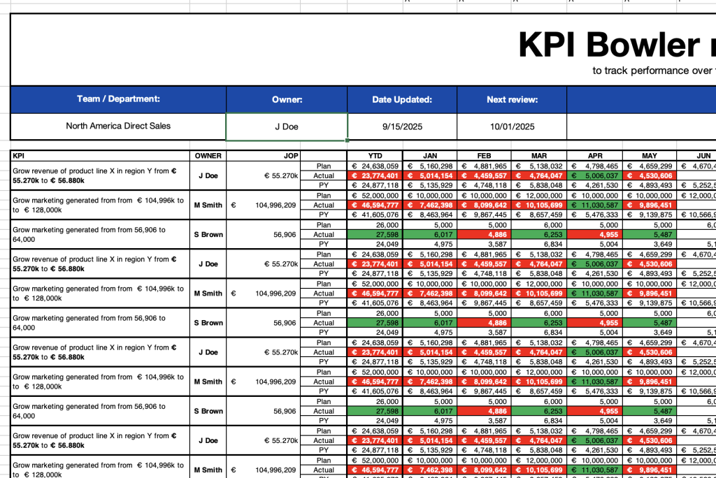
Bowler KPI Report Template
Visually track performance vs. targets with this Excel bowler chart. Lean-friendly and ready to use.